Mother's Day Table Setting

 
Mothers-Day-Table-Setting

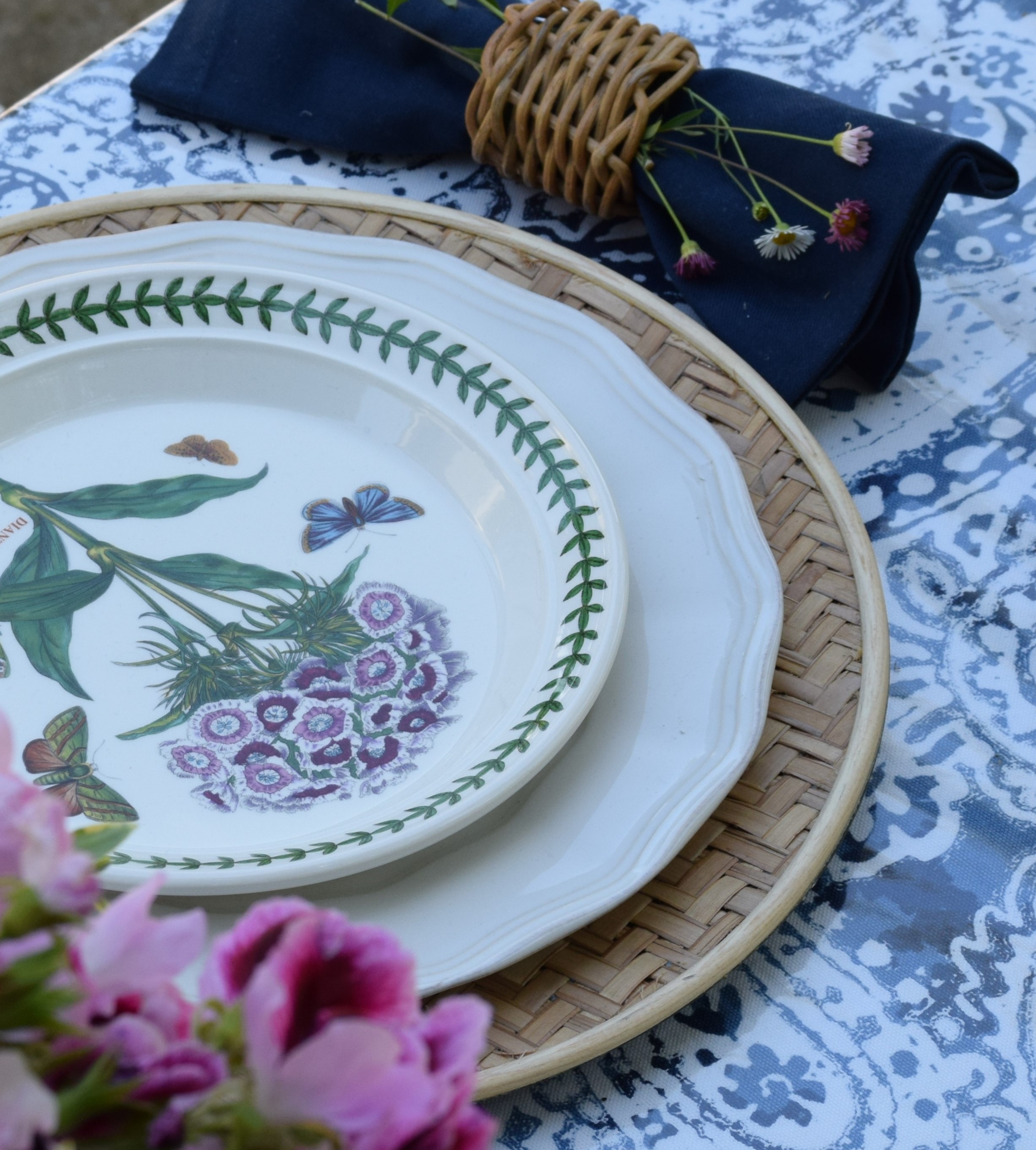
For Mother’s Day this last weekend, we invited our moms over for the day. I wanted to create something pretty for the moms and set out to make my table setting. I thought I would share the flower arrangement I created from my own garden flowers. I used my outdoor navy and white tablecloth, but added light and bright pinks. I also used floral salad plates in honor of Mother’s Day. Here are a few pictures of how it all came out. I hope everyone had a blessed day.

Roses-Geraniums-Peony-Bouquet
 

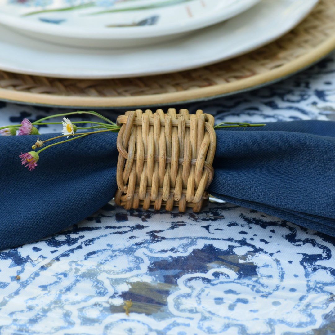
To create the arrangement I used one of my glass vases. The flowers that I used in my arrangement were: PInk Geraniums, Weigela, Vinca, Darcy Bussell Roses, Clotilde Soupert roses, red Valerian, Bowl of Beauty peony, Spirit of Freedom roses, and Winchester Cathedral roses. I also used Erigeron flowers as a garnish on my napkins shaped like bow-ties which is a great idea for a Father’s Day place setting.

Wicker-Napkin-Rings-With-Erigeron
 
Bow-Tie-Napkins
 
Navy-Pink-White-Tablesetting

Take care,

Christina


2019 Color of the Year!

Drum roll please …. and the winner is Living Coral, Pantone’s 2019 color of the year!


Pantoneslivingcoral (1).JPG

Living Coral is the color that you’ll be seeing a lot of this year from fashion to home fashions. Whether you pair it with navy, black, gray or green. This living color is sure to add a little pop to your room. If you’re like me and Living Coral is a little too bright for your interior needs, you might like to try Sherwin Williams color of the year.

Introducing the 2019 Sherwin-Williams Color of the Year: Cavern Clay SW 770. Surround yourself with layers of warm simplicity. Forged by sun. Fired by desert. Cavern Clay reflects endless freedom and unexplored horizons. Wood furniture, leather upholstery and worldly textiles help bring new life to any space

Sherwin Williams color of the year is Cavern Clay SW 7701 and is a little bit deeper.

Their color is not quite as bright as Pantone’s Living Coral. Cavern Clay is a rich earthy tone that looks great with a combination of other colors. I think Cavern Clay would work in a lot of different spaces really well. It is a nice medium tone not too dark or light, adds warmth but it isn’t jarring color. It looks really pretty in this dining room.

Sherwin Williams also has created several different color palettes that are new for this year and they are as follows:

SWshapeshifterpalette.JPG

Shapeshifter is a palette of blues, greenish blue, lilac and Nugget a golden yellow. These colors remind me of the ocean.

swwandererpalette.JPG

Wanderer has the new color of the year Cavern Clay and rich earthy brown, and tan tones with Distance for a contrasting color.

swafficionadopalette.JPG

Aficionado is one of my favorite collections with its Merlot, Alaea rose, Charcoal Blue, Dry Dock and Ancestral Gold shades.

swenthusiastpalette.JPG

Then you have Enthusiast with its bright tones. The colors in this palette remind me of sports teams. My favorite color here is Oceanside, but most of these colors I would like more as accents.

swnaturalistpalette.JPG

Next is the Naturalist palette, inspired by nature with its pinks, greens and beige tones. This is another favorite of mine.

swreconteurpalette.JPG

Last, but not least is the Raconteur color palette, mostly soft neutral colors with a few deep rich earth tones. So there you have it, the colors of the year for 2019. Which ones will you choose?

Take care,

Christina