How Do You Choose The Right Size Sofa?

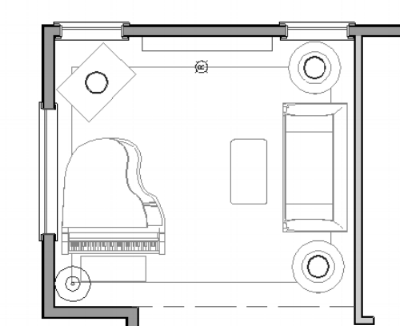
Living Room Furniture Plan

Living Room Furniture Plan

How do you choose the right size sofa for a room or how do you make sure the right pieces of furniture for a room are chosen?  Simple, you need a space plan or furniture plan.  A lot of times, we buy things on impulse!  We are out at the mall or at our favorite furniture store because we have seen an advertisement for that one day only sale! The catch is you have to buy it now.  We get pressured into making a quick decision to make the purchase for the discount.  

As a designer I have come across this a lot.  I have to admit, I've even done it myself a few times.  You see that must have chair or accessory.  You can save the % off or get special financing if you get it that day.  You'll think to yourself, I will find a place for it.  However, you can also sit in a comfy sofa or sectional at the store (usually a giant warehouse) only to get it home and discover it is too large, deep or just doesn't fit in your space properly.  It could even be the opposite, maybe you get the couch home and it is way too small for the space.

Why does this occur?  Is there something you can do to help make sure that you don't end up wasting money on something that really isn't the best option?  The answer is yes, you need a space plan.  The space plan helps to identify the right size sofa as well as the other furniture pieces you need.  Without a vision and a plan in place, you might not make the most out of your room, space, furniture and finances.  Part of the services of Interior Designers is to help you create the plan.

After meeting with you, we take a detailed inventory of measurements of your room, we collect dimensions of existing furnishings that will remain in your space, and then draw up your interior architectural drawings.  These drawings take into account the amount of space you need for traffic patterns, focal points, conversational areas, storage needs, and your activities just to name a few.  All of these factors are very important to consider.  Once we have those measurements, with your special considerations in mind, we map out exactly what size sofa you need and what other furniture would be a great fit.  

A space plan takes all of the worry and stress away from not knowing what to choose.  It helps you and your designer make your furniture selection much easier.  It ensures that you end up with the best possible solution(s) for your seating needs.  To learn more about my Space Planning Services, click here>>

Take care,

Christina

How To Design Your Guest Room Like A Luxury Hotel

Recently, I stayed at the Ritz Carlton in Palm Springs.  It got me thinking, why not write a blog post about all of the extras that a luxury hotel offers it's guests.  After all, these companies specialize in hospitality.  They provide us with a great guide to designing our own guest rooms.  I found myself looking around our room, taking notes, and pictures too of the design details that created that luxurious feeling.

Here are a few of the things I found to help you design your guest room like a luxury hotel:

ritz-carlton-hotel-room

1. Starting with the Walls: The walls had lots of texture, and the colors were all neutrals with organic materials.  In the bathroom ,the walls were tiled floor to ceiling, but not all the same tile.  Some was small stone horizontal mosaic, some was larger ceramic tile, there was also a wood wall separating the bath and the bedroom, and of course some painted walls.  The wall with the wood paneling and cornices mimicked wooden shutters and matched the doors that were in a shuttered style.  This same mahogany wood tone was used throughout the room.  By mixing the different materials and textures, it created a modern elegance with an eclectic kind of  feeling.

large-mirror-sconces.

2. Large Mirrors: The mirrors in the spaces were large over sized with very large framing.  The framing here really added a lot to the design.  The frames were all 5 to 6 inches in width.  The mirrors were all flanked with beautiful sconces.  I also love the idea of putting a floor to ceiling mirror somewhere by the exit so you can check your outfit before you or your guests head out.

3.Lighting: The lighting was all on dimmer switches another great idea.  The opal lamps in the bedroom area had a beautiful basket weave texture and were a great height next to the over-sized headboard.  The sconces next to the two large mirrors also were on dimmers providing nice accent lighting.  

Untitled design (5).png

4. Bedding: The King size bed had a large tufted headboard.  I really liked this because it was quite comfortable to lean against while watching T.V.  I decided to deconstruct the bed and take a look.  The firm mattress was topped with a very nice feather bed.  The feather bed set atop the mattress had an additional stain guard cushion on top of it for easy cleaning.  Next, the sheets and  a covered duvet on top of that.  The bed had a beautiful box pleated skirt and a combination of pillows in different sizes.  The pillows they used here were two Euros in back, followed by two king size pillows and two standards.  The final decorative pillow was a long lumbar pillow in a striped fabric of the headboard also adding a little more pattern to the decor. 

5. Two T.V.s: The T.V.s located in convenient places, one across from the bed, and the second in the bathroom next to the sink for easy viewing from the tub, shower or while getting ready.

6. An espresso maker: The espresso maker was complete with a drawer full of three different kinds of coffee and creamers, fresh waters bottles with the Ritz logo, and cups ready to go. The room also had a water bottle and glass by each side of the bed ready and waiting. 

7. Trays: In the bathroom vanity, a tray with rolled washcloths for easy use.  Another tray with designer glasses, shampoo samples, comb, nail file, and a container with cotton pads and q-tips.  Also in the vanity monogrammed towels with the Ritz logo added another luxurious touch to this bathroom.  Built-in shelving in the bathroom wall by the tub and in the vanity provided extra towels for convenience.  

8. Bathroom Fixtures: Extra deep and long soaking tub located in the shower.  On the shower wall,  a mirror located above the shower handle so you could see yourself while washing your hair.  The hardware in the bathroom was an upgraded heavier quality, with a classic design.  

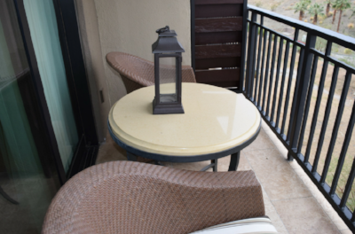
9. Outside balcony: The balcony had two cushioned rattan chairs, a side table with lantern as well as a view of the Palm Springs hills.  It was a little small, but was a nice extension of the room.

10. Closet Amenities: The closets offered guests plush robes, umbrella, flashlight, and different kinds of hangers both lingerie and standard, shoe polish, security safe, and plenty of space for your shoes.  These are all great ideas of things guests might need while traveling.

11. Final Touches: Belgian chocolates laid out on our bed. Who doesn't love this!  I always love to add a dish of chocolates for guests to snack on too.  By implementing some of these design ideas from the Ritz, you can leave your guests feeling completely pampered and spoiled.

Take care,

Christina